SWOLEMATE
SWOLEMATE
INTRODUCTION
Swolemate is a well-established company that launched a family and friends health tracking app three years ago. The app allows users within a group (a family or group of friends) to see how others within the group are doing regarding health and fitness.
However, on average, user engagement is heavy for the first three weeks then it drops off and soon after users delete the app. Which brings us to our problem statement: People who use the fitness app lose motivation and abandon the app, which leads to feelings of disappointment for the user and loss of engagement for the business.
As a designer, I was tasked with integrating a messaging feature that will increase engagement and repeated use.

Tools:
Figma
Roles:
UX Designer
UI Designer
UX Researcher

Duration:
Two weeks
RESEARCH
Secondary Research
When I was first tasked with adding a messaging feature to this fitness app, I had a lot of questions! I mostly wanted to explore what factors are affecting the motivation of the users of the fitness app, as well as how communication and community could be helpful in increasing engagement and repealed use.
Through my research, I found that one of the most effective motivators when it comes to long term fitness is community - having others to share your journey with. Which means that if the messaging feature tapped into that social motivator, it would create more engagement and retention.
How Might We’s:
How might we create a feeling of community for users?
How might we give users a chance to socialize?
How might we give users the opportunity to share their struggles and achievements with others?
Once I had a better understanding of the problem, I was able to define it:
Problem Statement:
People who use the fitness app lose motivation and abandon the app, which leads to feelings of disappointment for the user and loss of engagement for the business.
Insights:
People who are part of a fitness community are more likely to have long term results.
When people socialize, they are more likely to stay engaged.
Having someone to share struggles and achievements with aids in reaching fitness goals.
IDEATION
Solution Statement:
The user will have a social space where they can share their struggles and achievements with others who have similar fitness goals.
I created this space for the app by adding two features: Community and Messaging.
The Community Feature
Why a community feature?
Even though the messaging feature on its own would technically be a space for users to share their struggles and achievements with others, I still found that it didn’t fully solve the problem. I wondered:
If users only add friends and family they already know, what would be the benefit of using the messaging feature in the fitness app if simply texting, calling, or sending voice messages is a more familiar option?
If the user has no friends and family to join their fitness journey, they would not benefit from the social aspect of the app, which would not positively impact engagement.
By adding the community feature, we’re giving users a chance to connect with other users with similar fitness goals and interests within the app, so that they have a space to share their struggles and achievements regardless of whether or not they have friends and family joining them in their fitness journey.
Communities User Flow
When developing the experience of the Community feature, I decided to have a streamlined flow based on the interest of the user. The user first decides on a category of fitness to explore, and then views the different communities available for that category. Once in the community, the user can communicate with other users. I picked this flow to ensure that the user interacts with like-minded individuals who partake in the same fitness activities, instead of just communicating with random strangers on the app. This will help create that feeling of camaraderie and community that will increase engagement and repeated use.

Communities feature user flow
The Messaging Feature
At the end of the day, the messaging feature has one purpose: to help solve the problem for the user and the business.
The problem for the user is the feelings of disappointment they feel after they lose motivation and abandon the app.
The problem for the business is the loss of engagement for the business.
To do this, it must be a social space where they can share their struggles and achievements with others who have similar fitness goals. But to do this, they must have people to communicate with. To find people to communicate with, users can:
Invite friends to join the app
Add friends by username
Find users to message in the Communities tab
This feature is messaging only - meaning it does not support sending or receiving documents or voice messages. I made this choice simply because the problem can be solved without adding those features, as all that is needed is a social space to share struggles and achievements with others who have similar fitness goals.
Messaging User Flow
The messaging feature is modeled after most popular messaging products, so it’ll be familiar for the user. The flow is simple: After navigating to the Messages section by pressing the appropriate icon, find an ongoing conversation to continue, or search for the person you would like to message.

Messaging User Flow
DESIGN
After I had designed the flows that will solve the problem for both the user and the business, it was time to design what the screens were actually gonna look like. Since I was designing two features for an already existing product, I had to take the design of the home app into consideration when designing my wireframes.


Original Business Wireframes
Homepage Wireframe

When designing the homepage, I left it almost identical to the wireframe provided, except for a few additions:
A messaging icon: This will take the user to the messaging feature that has been added to the app. The icon will also notify when the user has a new message, and how many new messages are waiting to be read. I added this because having an accessible place to the messaging feature is essential, since the messaging feature is one of the solutions to the problem.
A notification icon: The notification icon will inform the user of any new developments in the app, such as friend requests, acceptance of friend requests, and new activity or mentions in any of the communities they have joined. I added this because being aware of what is going on in the communities will keep the user engaged with that feature, which is part of the solution to increate engagement and retention.
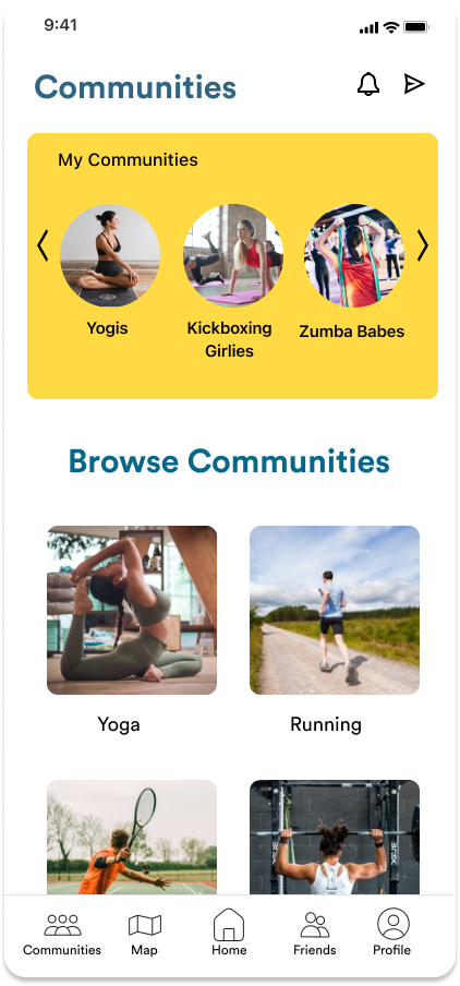
Communities Wireframes


In the communities main screen, I focused on:
My Communities: It was important to have a place for users to quickly access the communities they have already joined. It is important because it will keep the users returning to the group due to easy access, which will keep them engaged.
Browse Communities: In the browse communities area, users will choose which category of community they are looking for, and then browse the available groups within that category. Browsing through categories will keep the communities organized, and keep the user from feeling overwhelmed by the large amount of possible groups to browse.
Once they have picked a category, users can scroll through the available groups in that category. Once they pick which group they wish to view, they may enter the public chatroom for the group and decide if it’s a community they wish to join.
If they wish to join the community, simply pressing the “add” icon is a simple and effective way to have that community added to the “My Communities” section for easy access. Users will also be notified of the activity going on within the community.
Messaging Wireframes


I kept the wireframes for the messaging feature very simple, modeling it after the average messenger. I did this so the feature would be familiar and intuitive for the user - so it wouldn’t stray from their expectations and create unnecessary usability issues. It is as they say: “If it isn’t broken, don’t fix it.”
The messaging feature has a list of their latest messaging chains they have participated in, where they can resume any conversations, or easily access friends they message frequently. Users can also compose a new message from scratch by pressing the icon at the top right corner. They may also search keywords or names in the search to find older conversations or friends they haven’t messaged recently.
The MVP for the messenger itself only uses text, as it is not necessary for the solution to send or receive any kind of media. The focus is on the communication with other users that have similar fitness goals, so they can share their struggles and achievements. This is what will aid in increasing engagement and retention within the app.
TEST
During the first round of testing, my goal was to uncover any usability issues, and to test out how well the messaging and communities features fit in the fitness app. To achieve this, I gave the participants three tasks to complete on the wireframe prototype, while asking them to please verbalize what they are going to do prior to completing the action. The participants were also encouraged to share their reasoning or thoughts if they wished. The participants all fit the criteria of the target users for the app: Very tech-savvy 18-34 year olds who are budget conscious and indicated that messaging and communicating with friends and family is a very important part of their daily lives. The participants have also all used fitness apps in the past and expressed having experienced the problem the social feature is looking to solve for the user: Some people who use a fitness app lose motivation and abandon the app. This leads to feelings of disappointment for the user and loss of engagement for the business.
Findings:
Issue #1
When having to find the Communities tab, all users expressed confusion on where it was. Some pressed different icons until finding the correct one, while one simply guessed correctly.
Summary:
Users were frustrated that they couldn’t find the Communities page.
The icon used for Communities was easy to mistake with the friends or profile icons.
The users tapped on different icons until finding the correct one.
Recommendations:
Change the icon to a more recognizable icon.
Add the name of the page under the icon.
Issue #2
When pressing the “wrong” icon for the task, if it took them to a different screen, there was no way to return to the homescreen for certain tasks.
Summary:
While using the prototype, users couldn’t go back to a previous page.
Some users had to restart the Figma app because there was no way to return and complete the task.
Recommendations:
Add an arrow or some other kind of icon to allow users to return to the previous screen when the menu bar is unavailable.
Add the menu bar to all screens.

Solution table
After making note of the usability issues I encountered, I made a chart to aid me in finding a solution. In the first column I defined the problem, on the second column I summarized the insight I gained from the problem, and in the final chart I added some possible solutions, as well as how long each solution would take. By comparing the time the solution would take with its effectiveness in solving the problem, I was able to choose the best solutions:
Add words to the menu bar while leaving the icons the same.
Add a return icon to all pages that do not have the menu bar.
REFLECTION
While using fitness apps, such as Swolemate, many people lose motivation and abandon the app, which leads to feelings of disappointment for the user and loss of engagement for the business. As a designer, I was tasked with integrating a messaging feature that will increase engagement and repeated use. To solve this problem, I chose to create a social space where the users can share their struggles and achievements with others who have similar fitness goals. I did this by adding not just the messaging feature that was tasked of me, but also a community feature where users can find like-minded people with whom they can share their fitness journey with. Based on the research that I conducted, as well as the two usability tests I performed, I am confident that this solution will successfully increase engagement and repetition of use for the app, meeting the goals of both the business and the user! Solving this problem and designing these features was a wonderful experience in working within the constraints of an already established product, as well as the business goals and expectations of a client.